

Astro核心内容总结
本文最后更新于 2025-06-11,文章内容可能已经过时。
在官方文档中,写的还是非常详细的,我将通过官方文档,简单的了解一下Astro
官方文档地址:
官方文档里面是 组件 、布局、 样式(CSS)、字体,还有引用一些npm包的教程,简单总结一下
组件
组件就是Astro构建的基础模块,纯html 无需客户端运行时的模板组件。
文件后缀名是
.astro目录
/src整体的使用感受和cms那种模块化模板很像,代码风格和TS很像
格式
---
// 组件脚本(JavaScript)
---
<!-- 组件模板(HTML + JS 表达式)-->
组件脚本
Astro 使用代码围栏(
---)来识别 Astro 组件中的组件脚本。如果你以前写过 Markdown,你可能已经熟悉了叫做 frontmatter 的类似概念。
Astro 的组件脚本的想法直接受到了这个概念的启发。
它的代码围栏的主要目的就是保证你编写或引用的js被‘’围起来‘’,
它并不会直接在前端展示原始代码,有点类似于常见的cms的标签引用的逻辑,只是获取数据,然后渲染到前端。
脚本可以引用的类型:
导入其他 Astro 组件
导入其他框架组件,如 React
导入数据,如 JSON 文件
从 API 或数据库中获取内容
创建你要在模板中引用的变量
---
import SomeAstroComponent from '../components/SomeAstroComponent.astro';

import SomeReactComponent from '../components/SomeReactComponent.jsx';

import someData from '../data/pokemon.json';

// 访问传入的组件参数,如 `<X title="Hello, World"/>`
const { title } = Astro.props;

// 获取外部数据,甚至可以从私有 API 和数据库中获取
const data = await fetch ('SOME_SECRET_API_URL/users').then (r => r.json ());
---
<!-- 你的模板在这! -->
组件模板
组件模板决定了组件最终输出的 HTML。
它不仅能写普通的 HTML,还能结合脚本(--- 部分)中的数据和 JavaScript 表达式,来动态生成更复杂的 HTML 内容。
---
// 组件脚本: 定义逻辑与数据 (仅在服务器运行)

// 导入其他组件
import Banner from '../components/Banner.astro';
import Avatar from '../components/Avatar.astro';
import ReactPokemonComponent from '../components/ReactPokemonComponent.jsx';

// 定义数据
const myFavoritePokemon = [
  { id: 1, name: '皮卡丘' },
  { id: 2, name: '小火龙' },
  { id: 3, name: '妙蛙种子' }
];

// 接收 Props (可设置默认值)
const { title = "组件默认标题" } = Astro.props;
---

<!-- 组件模板: 定义 HTML 结构 -->

<!-- 直接渲染导入的组件 -->
<Banner />

<!-- 使用 {} 渲染变量 -->
<h1>{title}</h1>

<!-- .map() 遍历数组,生成列表 -->
<ul>
  {myFavoritePokemon.map(pokemon => (
    <li>{pokemon.name}</li>
  ))}
</ul>

<!-- `client:visible`: 组件可见时加载 JS,实现交互 -->
<ReactPokemonComponent client:visible />

<!-- `server:defer`: 延迟渲染,不阻塞页面加载 -->
<Avatar server:defer>
  <!-- `slot="fallback"`: 组件加载完成前显示的占位符 -->
  <div slot="fallback">正在加载...</div>
</Avatar>

<!-- `class:list`: 动态组合 CSS 类 -->
<!-- 生成 class="card featured highlight" -->
<div class:list={[ "card", { featured: true }, "highlight" ]} />
基于组件的设计
官方说的有点含糊
个人理解:
头部(header)页脚(footer)侧边栏 等每个界面几乎都复用的组件
有点类似CMS中模板(主题)的写法
组件库类型
比如构建一个组件库模板,将按钮、徽章 各类组件单独写在单独文件中的写法
组件参数
Astro 组件可以定义和接受参数。
这些参数可用于组件模板以呈现 HTML。可以在 frontmatter script 中的 Astro.props 中使用。
这一块个人感觉非常像
TypeScript/React组件,
下面我用一个案例展示
可以清晰的看出,组件为一个div,然后有一些样式,在主界面 通过组件参数方式 ,填写对应的参数值即可。
---
//  src\pages\simple.astro
// 简单演示页面
import Layout from '../layouts/Layout.astro';
import SimpleCard from '../components/SimpleCard.astro';
---

<Layout title="简单组件参数演示">
  <main>
    <h1>Astro 组件参数简单演示</h1>

    <!-- 直接传递字符串参数 -->
    <SimpleCard
      title="欢迎使用 Astro"
      content="这是一个简单的卡片组件示例。"
    />

    <!-- 使用变量传递参数 -->
    <SimpleCard
      title="动态内容"
      content="这个内容来自变量传递。"
    />

    <!-- 传递不同的内容 -->
    <SimpleCard
      title="学习要点"
      content="组件通过 Astro.props 接收参数,然后在模板中使用花括号 {} 显示。"
    />
  </main>
</Layout>

<style>
  main {
    max-width: 800px;
    margin: 0 auto;
    padding: 20px;
  }

  h1 {
    text-align: center;
    color: #333;
    margin-bottom: 30px;
  }
</style>
---
// src\components\SimpleCard.astro
// 简单卡片组件 - 接受标题和内容参数
// 使用方式:<SimpleCard title="我的标题" content="这是内容" />
const { title, content } = Astro.props;
---
<div class="card">
<h2>{title}</h2>
<p>{content}</p>
</div>
<style>
.card {
border: 1px solid #ddd;
border-radius: 8px;
padding: 20px;
margin: 10px;
background: white;
box-shadow: 0 2px 4px rgba(0,0,0,0.1);
}
h2 {
color: #333;
margin-top: 0;
}
p {
color: #666;
line-height: 1.5;
}
</style> 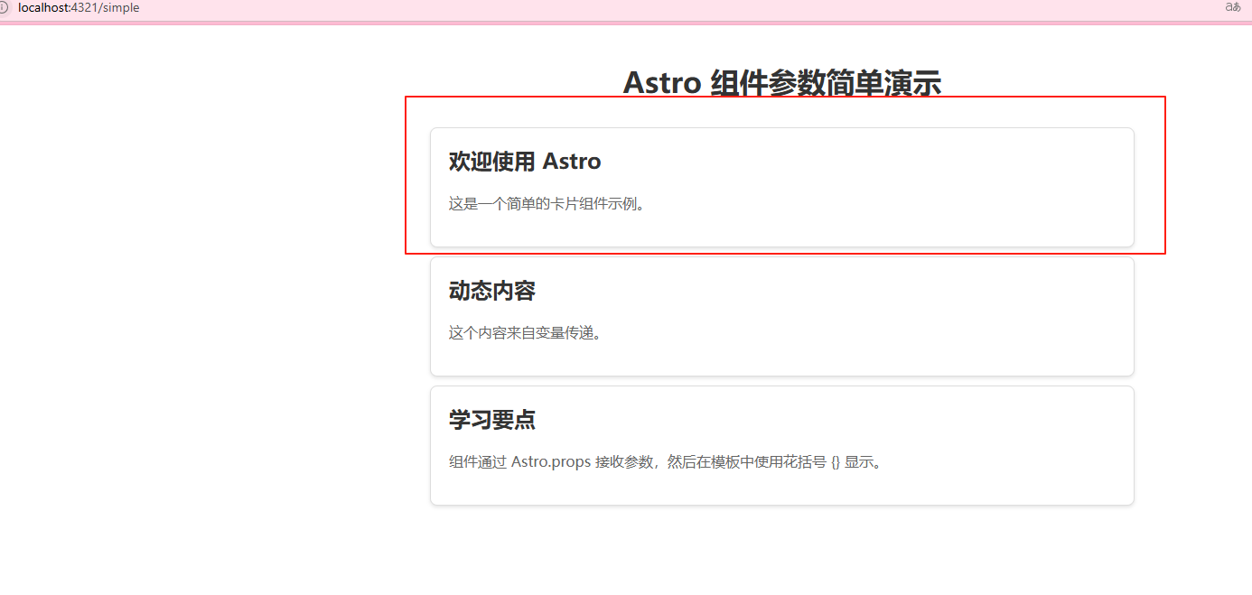
插槽
<slot /> 元素是嵌入外部 HTML 内容的占位符,你可以将其他文件中的子元素注入(或“嵌入”)到组件模板中。
默认情况下,传递给组件的所有子元素都将呈现在 <slot /> 中。
Slot 就像是组件中的"空位",可以让你往里面放内容。
这个功能和有后端的CMS的标签实现方式的逻辑是不是很像?
想象一下:
组件 = 一个相框
Slot = 相框中间的空位
你可以往空位里放任何图片(内容)
举一个简单的案例:
创建一个有"空位"的组件
<!-- Box.astro -->
<div class="box">
  <slot />  <!-- 这就是"空位" -->
</div>
使用组件时往"空位"里放内容
<Box>
  <p>我是放进去的内容</p>  <!-- 这些内容会出现在 slot 的位置 -->
</Box>
最终效果
<div class="box">
  <p>我是放进去的内容</p>
</div>
命名插槽 = 多个"空位"
<!-- Card.astro -->
<div class="card">
  <div class="header">
    <slot name="title" />  <!-- 标题空位 -->
  </div>
  <div class="body">
    <slot />  <!-- 内容空位(默认) -->
  </div>
</div>
<Card>
<h2 slot="title">我的标题</h2> <!-- 放到 title 空位 -->
<p>我的内容</p> <!-- 放到默认空位 -->
</Card>布局
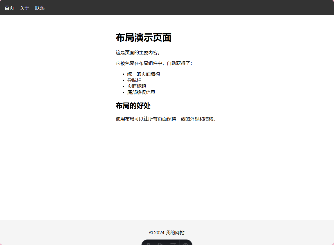
布局是可重用的页面模板,提供统一的页面结构和样式。
这个就是组件组成的布局,为可重复用的模板。
比如:标题,导航栏,页脚这种组件
基础布局
---
// 使用基础布局的页面
import SimpleLayout from '../layouts/SimpleLayout.astro';
---

<SimpleLayout title="布局演示页面">
  <p>这是页面的主要内容。</p>
  <p>它被包裹在布局组件中,自动获得了:</p>
  <ul>
    <li>统一的页面结构</li>
    <li>导航栏</li>
    <li>页面标题</li>
    <li>底部版权信息</li>
  </ul>

  <h2>布局的好处</h2>
  <p>使用布局可以让所有页面保持一致的外观和结构。</p>
</SimpleLayout>
---
// 基础布局组件
const { title } = Astro.props;
---
<html lang="zh-CN">
<head>
<meta charset="utf-8">
<meta name="viewport" content="width=device-width, initial-scale=1">
<title>{title}</title>
</head>
<body>
<!-- 页面头部 -->
<header>
<nav>
<a href="/">首页</a>
<a href="/about">关于</a>
<a href="/contact">联系</a>
</nav>
</header>
<!-- 主要内容区域 -->
<main>
<h1>{title}</h1>
<slot /> <!-- 页面内容插入这里 -->
</main>
<!-- 页面底部 -->
<footer>
<p>© 2024 我的网站</p>
</footer>
</body>
</html>
<style>
body {
font-family: Arial, sans-serif;
margin: 0;
padding: 0;
min-height: 100vh;
display: flex;
flex-direction: column;
}
header {
background: #333;
color: white;
padding: 1rem;
}
nav a {
color: white;
text-decoration: none;
margin-right: 1rem;
}
nav a:hover {
text-decoration: underline;
}
main {
flex: 1;
padding: 2rem;
max-width: 800px;
margin: 0 auto;
}
footer {
background: #f5f5f5;
text-align: center;
padding: 1rem;
margin-top: auto;
}
</style> 效果图:
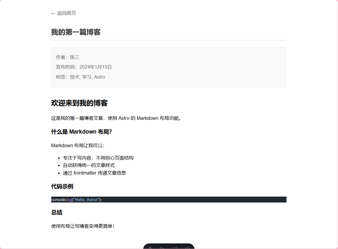
Markdown 布局
可以使用md格式去渲染
---
layout: ../layouts/BlogLayout.astro
title: "我的第一篇博客"
author: "张三"
date: "2024年1月15日"
tags: ["技术", "学习", "Astro"]
---

## 欢迎来到我的博客

这是我的第一篇博客文章,使用 Astro 的 Markdown 布局功能。

### 什么是 Markdown 布局?

Markdown 布局让我可以:

- 专注于写内容,不用担心页面结构
- 自动获得统一的文章样式
- 通过 frontmatter 传递文章信息

### 代码示例

```javascript
console.log("Hello, Astro!");
```

### 总结

使用布局让写博客变得更简单!
---
// 博客文章布局
const { frontmatter } = Astro.props;
---

<html lang="zh-CN">
  <head>
    <meta charset="utf-8">
    <meta name="viewport" content="width=device-width, initial-scale=1">
    <title>{frontmatter.title}</title>
  </head>
  <body>
    <header>
      <a href="/">← 返回首页</a>
    </header>

    <article>
      <!-- 文章标题 -->
      <h1>{frontmatter.title}</h1>

      <!-- 文章信息 -->
      <div class="meta">
        <p>作者:{frontmatter.author}</p>
        <p>发布时间:{frontmatter.date}</p>
        {frontmatter.tags && (
          <p>标签:{frontmatter.tags.join(', ')}</p>
        )}
      </div>

      <!-- 文章内容 -->
      <div class="content">
        <slot /> <!-- Markdown 内容插入这里 -->
      </div>
    </article>
  </body>
</html>

<style>
  body {
    font-family: Arial, sans-serif;
    max-width: 800px;
    margin: 0 auto;
    padding: 2rem;
    line-height: 1.6;
  }

  header {
    margin-bottom: 2rem;
  }

  header a {
    color: #666;
    text-decoration: none;
  }

  header a:hover {
    text-decoration: underline;
  }

  h1 {
    color: #333;
    border-bottom: 2px solid #eee;
    padding-bottom: 0.5rem;
  }

  .meta {
    background: #f9f9f9;
    padding: 1rem;
    border-radius: 5px;
    margin: 1rem 0;
  }

  .meta p {
    margin: 0.5rem 0;
    color: #666;
  }

  .content {
    margin-top: 2rem;
  }
</style>
效果图:
嵌套布局
嵌套结构:
BaseLayout (框架)
└── ArticleLayout (文章)
└── 页面内容
---
// 文章布局 - 嵌套在基础布局中
import BaseLayout from './BaseLayout.astro';
const { title, author, date } = Astro.props;
---

<BaseLayout title={title}>
  <main class="article-container">
    <!-- 文章头部 -->
    <header class="article-header">
      <h1>{title}</h1>
      <div class="article-meta">
        <span>作者:{author}</span>
        <span>发布:{date}</span>
      </div>
    </header>

    <!-- 文章内容 -->
    <article class="article-content">
      <slot />
    </article>

    <!-- 文章底部 -->
    <div class="article-footer">
      <p>感谢阅读!</p>
    </div>
  </main>
</BaseLayout>

<style>
  .article-container {
    max-width: 800px;
    margin: 0 auto;
    padding: 2rem;
    flex: 1;
  }

  .article-header {
    border-bottom: 3px solid #3498db;
    padding-bottom: 1rem;
    margin-bottom: 2rem;
  }

  .article-header h1 {
    color: #2c3e50;
    margin: 0 0 1rem 0;
    font-size: 2.5rem;
  }

  .article-meta {
    color: #7f8c8d;
  }

  .article-meta span {
    margin-right: 2rem;
  }

  .article-content {
    line-height: 1.8;
    font-size: 1.1rem;
  }

  .article-footer {
    margin-top: 3rem;
    padding-top: 2rem;
    border-top: 1px solid #ecf0f1;
    text-align: center;
    color: #95a5a6;
  }
</style>
---
// 基础布局 - 提供页面框架
const { title } = Astro.props;
---

<html lang="zh-CN">
  <head>
    <meta charset="utf-8">
    <meta name="viewport" content="width=device-width, initial-scale=1">
    <title>{title}</title>
  </head>
  <body>
    <!-- 全站导航 -->
    <nav class="main-nav">
      <a href="/">首页</a>
      <a href="/blog">博客</a>
      <a href="/about">关于</a>
    </nav>

    <!-- 内容区域 -->
    <slot />

    <!-- 全站底部 -->
    <footer>
      <p>© 2024 我的网站 - 所有权利保留</p>
    </footer>
  </body>
</html>

<style>
  body {
    font-family: Arial, sans-serif;
    margin: 0;
    padding: 0;
    min-height: 100vh;
    display: flex;
    flex-direction: column;
  }

  .main-nav {
    background: #2c3e50;
    padding: 1rem;
  }

  .main-nav a {
    color: white;
    text-decoration: none;
    margin-right: 2rem;
    font-weight: bold;
  }

  .main-nav a:hover {
    color: #3498db;
  }

  footer {
    background: #34495e;
    color: white;
    text-align: center;
    padding: 1rem;
    margin-top: auto;
  }
</style>
---
// 使用嵌套布局的页面
import ArticleLayout from '../layouts/ArticleLayout.astro';
---
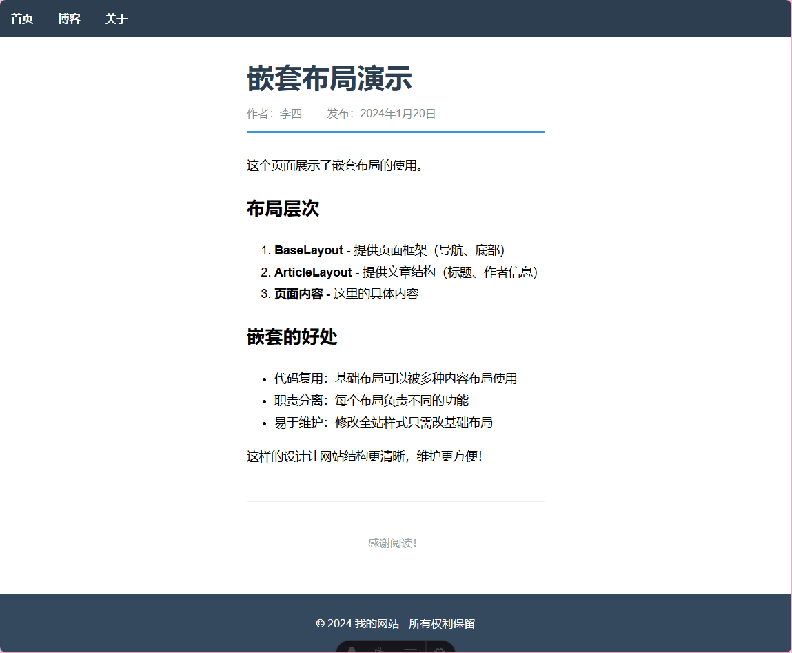
<ArticleLayout
title="嵌套布局演示"
author="李四"
date="2024年1月20日"
>
<p>这个页面展示了嵌套布局的使用。</p>
<h2>布局层次</h2>
<ol>
<li><strong>BaseLayout</strong> - 提供页面框架(导航、底部)</li>
<li><strong>ArticleLayout</strong> - 提供文章结构(标题、作者信息)</li>
<li><strong>页面内容</strong> - 这里的具体内容</li>
</ol>
<h2>嵌套的好处</h2>
<ul>
<li>代码复用:基础布局可以被多种内容布局使用</li>
<li>职责分离:每个布局负责不同的功能</li>
<li>易于维护:修改全站样式只需改基础布局</li>
</ul>
<p>这样的设计让网站结构更清晰,维护更方便!</p>
</ArticleLayout> 效果图:
样式/CSS
src/
layouts/Layout.astro— 基础布局
components/ScopedStyles.astro— 作用域样式GlobalStyles.astro— 全局样式ClassList.astro— 动态类名CSSVariables.astro— CSS 变量InlineStyles.astro— 内联样式ExternalStyles.astro— 外部样式表SassDemo.astro— Sass 预处理器
styles/external.css— 外部样式文件
pages/css-demo.astro— 总览演示页面
css-demo.astro
---
// CSS 功能总览演示页面
import Layout from '../layouts/Layout.astro';
import ScopedStyles from '../components/ScopedStyles.astro';
import GlobalStyles from '../components/GlobalStyles.astro';
import ClassList from '../components/ClassList.astro';
import CSSVariables from '../components/CSSVariables.astro';
import InlineStyles from '../components/InlineStyles.astro';
import ExternalStyles from '../components/ExternalStyles.astro';
import SassDemo from '../components/SassDemo.astro';
---

<Layout title="Astro CSS 功能演示">
  <main>
    <h1>Astro CSS 功能演示</h1>
    <p class="intro">这个页面展示了 Astro 中各种 CSS 功能的使用方法</p>

    <!-- 全局样式演示 -->
    <section class="demo-section">
      <h2>1. 全局样式</h2>
      <GlobalStyles>
        <p class="global-title">这个标题使用全局样式</p>
        <p class="global-text">这个文本也使用全局样式</p>
      </GlobalStyles>
    </section>

    <!-- 作用域样式演示 -->
    <section class="demo-section">
      <h2>2. 作用域样式</h2>
      <ScopedStyles />
    </section>

    <!-- 动态类名演示 -->
    <section class="demo-section">
      <h2>3. 动态类名 (class:list)</h2>
      <div class="class-list-examples">
        <ClassList isActive={true} size="large" theme="dark" />
        <ClassList isActive={false} size="small" theme="light" />
      </div>
    </section>

    <!-- CSS 变量演示 -->
    <section class="demo-section">
      <h2>4. CSS 变量 (define:vars)</h2>
      <div class="css-vars-examples">
        <CSSVariables primaryColor="#e91e63" secondaryColor="#9c27b0" fontSize="18px" />
        <CSSVariables primaryColor="#4caf50" secondaryColor="#ff9800" fontSize="14px" />
      </div>
    </section>

    <!-- 内联样式演示 -->
    <section class="demo-section">
      <h2>5. 内联样式</h2>
      <InlineStyles bgColor="#fff3e0" textColor="#e65100" padding="1.5rem" />
    </section>

    <!-- 外部样式表演示 -->
    <section class="demo-section">
      <h2>6. 外部样式表</h2>
      <ExternalStyles />
    </section>

    <!-- Sass 预处理器演示 -->
    <section class="demo-section">
      <h2>7. Sass 预处理器</h2>
      <div class="sass-examples">
        <SassDemo theme="light" />
        <SassDemo theme="dark" />
      </div>
    </section>
  </main>
</Layout>

<style>
  main {
    max-width: 1200px;
    margin: 0 auto;
    padding: 2rem;
  }

  h1 {
    text-align: center;
    color: #2c3e50;
    margin-bottom: 1rem;
  }

  .intro {
    text-align: center;
    font-size: 1.2rem;
    color: #7f8c8d;
    margin-bottom: 3rem;
  }

  .demo-section {
    margin-bottom: 3rem;
    padding: 2rem;
    background: #f8f9fa;
    border-radius: 12px;
    border-left: 4px solid #3498db;
  }

  .demo-section h2 {
    color: #2c3e50;
    margin-top: 0;
    margin-bottom: 1.5rem;
  }

  .class-list-examples,
  .css-vars-examples,
  .sass-examples {
    display: grid;
    gap: 2rem;
  }

  .summary {
    background: linear-gradient(135deg, #667eea 0%, #764ba2 100%);
    color: white;
    padding: 3rem;
    border-radius: 12px;
    margin-top: 3rem;
  }

  .summary h2 {
    text-align: center;
    margin-bottom: 2rem;
  }

  .features-grid {
    display: grid;
    grid-template-columns: repeat(auto-fit, minmax(250px, 1fr));
    gap: 1.5rem;
  }

  .feature-card {
    background: rgba(255,255,255,0.1);
    padding: 1.5rem;
    border-radius: 8px;
    backdrop-filter: blur(10px);
  }

  .feature-card h3 {
    margin-top: 0;
    margin-bottom: 0.5rem;
  }

  .feature-card p {
    margin-bottom: 0;
    opacity: 0.9;
  }

  code {
    background: rgba(255,255,255,0.2);
    padding: 0.2rem 0.4rem;
    border-radius: 3px;
    font-size: 0.9rem;
  }

  @media (max-width: 768px) {
    .features-grid {
      grid-template-columns: 1fr;
    }

    .demo-section {
      padding: 1rem;
    }
  }
</style>
Layout.astro
---
// 基础布局组件
export interface Props {
  title: string;
  description?: string;
}

const { title, description = "Astro CSS 功能演示" } = Astro.props;
---

<!DOCTYPE html>
<html lang="zh-CN">
  <head>
    <meta charset="UTF-8" />
    <meta name="description" content={description} />
    <meta name="viewport" content="width=device-width, initial-scale=1.0" />
    <link rel="icon" type="image/svg+xml" href="/favicon.svg" />
    <title>{title}</title>
  </head>
  <body>
    <slot />
  </body>
</html>

<style is:global>
  html {
    font-family: system-ui, sans-serif;
  }

  body {
    margin: 0;
    padding: 0;
    background: #ffffff;
    color: #333;
    line-height: 1.6;
  }

  * {
    box-sizing: border-box;
  }
</style>
全局样式
GlobalStyles.astro
---
// 全局样式演示组件
---

<div class="global-demo">
  <h2>全局样式演示</h2>
  <p>这个组件定义了全局样式</p>
  <div class="child-content">
    <slot />
  </div>
</div>

<style is:global>
  /* 全局样式 - 会影响整个页面 */
  .global-title {
    color: purple;
    text-align: center;
    font-size: 1.5rem;
  }

  .global-text {
    background: #ffe6f0;
    padding: 1rem;
    border-left: 4px solid purple;
  }
</style>

<style>
  /* 作用域样式 - 只影响这个组件 */
  .global-demo {
    border: 2px dashed #ccc;
    padding: 1rem;
    margin: 1rem 0;
  }

  h2 {
    color: #333;
    margin-top: 0;
  }
</style> 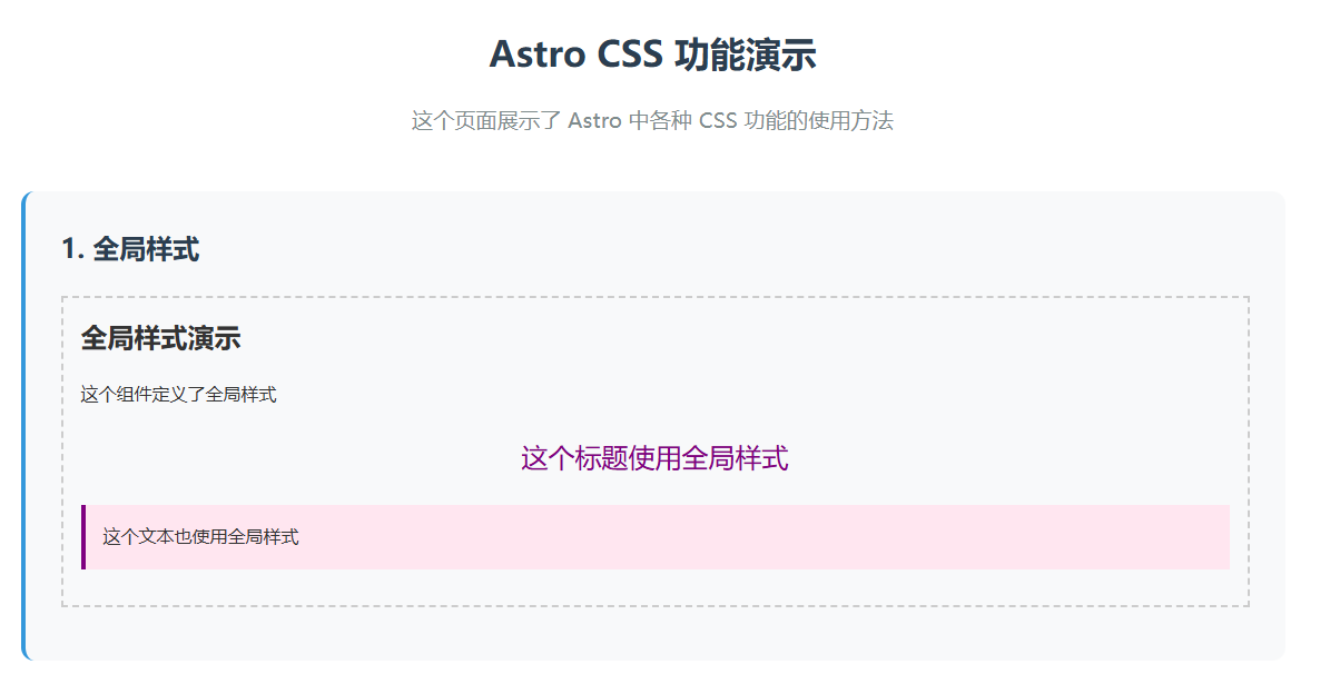
作用域样式
ScopedStyles.astro
---
// 作用域样式演示组件
---

<div class="container">
  <h1>作用域样式标题</h1>
  <p class="text">这个文字有作用域样式</p>
  <button class="btn">按钮</button>
</div>

<style>
  /* 这些样式只会应用到这个组件内 */
  h1 {
    color: blue;
    font-size: 2rem;
  }

  .text {
    color: green;
    background: #f0f8ff;
    padding: 1rem;
    border-radius: 5px;
  }

  .btn {
    background: #ff6b6b;
    color: white;
    border: none;
    padding: 0.5rem 1rem;
    border-radius: 4px;
    cursor: pointer;
  }

  .btn:hover {
    background: #ff5252;
  }
</style> 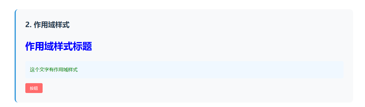
动态类名 (class:list)
ClassList.astro
---
// class:list 动态类名演示
const { isActive, size, theme } = Astro.props;

// 模拟一些条件
const isLarge = size === 'large';
const isDark = theme === 'dark';
---

<div class="demo-container">
  <h3>class:list 动态类名演示</h3>

  <!-- 基础用法 -->
  <div class:list={['box', { active: isActive }]}>
    基础动态类名 {isActive ? '(激活)' : '(未激活)'}
  </div>

  <!-- 复杂用法 -->
  <div class:list={[
    'card',
    {
      'card--large': isLarge,
      'card--dark': isDark,
      'card--active': isActive
    },
    size && `card--${size}`
  ]}>
    复杂动态类名
    <br />
    尺寸: {size || '默认'}
    <br />
    主题: {theme || '默认'}
  </div>

  <!-- 数组形式 -->
  <div class:list={['button', isActive && 'button--active', isDark && 'button--dark']}>
    数组形式的动态类名
  </div>
</div>

<style>
  .demo-container {
    padding: 1rem;
    border: 1px solid #ddd;
    border-radius: 8px;
  }

  .box {
    padding: 1rem;
    margin: 0.5rem 0;
    border: 2px solid #ccc;
    border-radius: 4px;
    background: #f9f9f9;
  }

  .box.active {
    border-color: #4CAF50;
    background: #e8f5e9;
    color: #2e7d32;
  }

  .card {
    padding: 1rem;
    margin: 0.5rem 0;
    border: 1px solid #ddd;
    border-radius: 6px;
    background: white;
    transition: all 0.3s ease;
  }

  .card--large {
    padding: 2rem;
    font-size: 1.2rem;
  }

  .card--dark {
    background: #333;
    color: white;
    border-color: #555;
  }

  .card--active {
    transform: scale(1.05);
    box-shadow: 0 4px 8px rgba(0,0,0,0.2);
  }

  .button {
    display: inline-block;
    padding: 0.5rem 1rem;
    margin: 0.5rem 0;
    background: #2196F3;
    color: white;
    border: none;
    border-radius: 4px;
    cursor: pointer;
  }

  .button--active {
    background: #4CAF50;
  }

  .button--dark {
    background: #424242;
  }
</style> 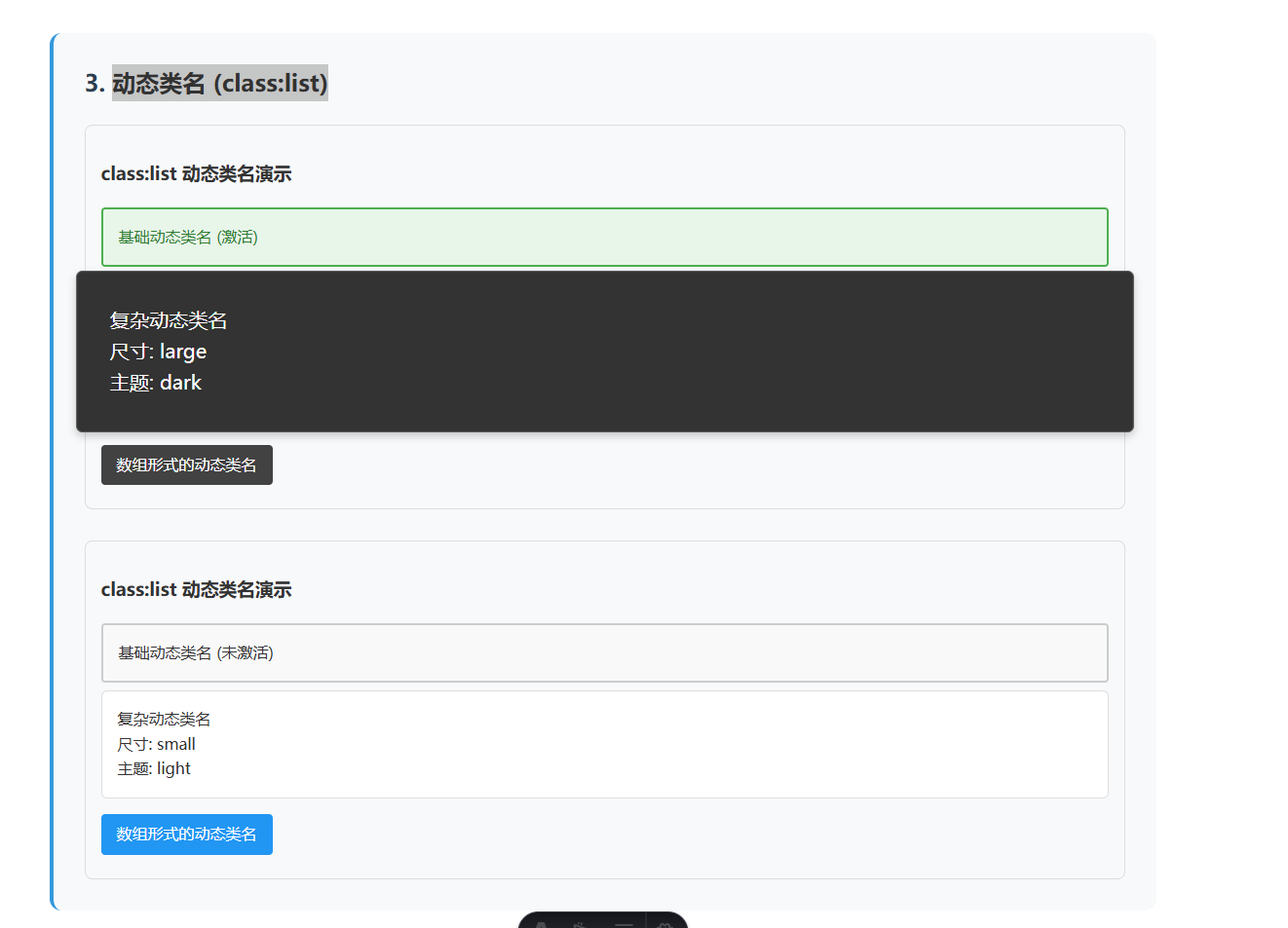
CSS 变量 (define:vars)
CSSVariables.astro
---
// CSS 变量演示组件
const { primaryColor = "#3498db", secondaryColor = "#e74c3c", fontSize = "16px" } = Astro.props;

// 动态计算颜色
const lightColor = primaryColor + "20"; // 添加透明度
const borderColor = secondaryColor;
---

<div class="variables-demo">
  <h3>CSS 变量演示</h3>

  <div class="card primary">
    <h4>主色卡片</h4>
    <p>使用 define:vars 传递的主色</p>
  </div>

  <div class="card secondary">
    <h4>次色卡片</h4>
    <p>使用 define:vars 传递的次色</p>
  </div>

  <div class="card mixed">
    <h4>混合样式卡片</h4>
    <p>结合多个 CSS 变量的效果</p>
  </div>
</div>

<style define:vars={{ primaryColor, secondaryColor, fontSize, lightColor, borderColor }}>
  .variables-demo {
    padding: 1rem;
    font-size: var(--fontSize);
  }

  .card {
    padding: 1rem;
    margin: 1rem 0;
    border-radius: 8px;
    border: 2px solid var(--borderColor);
    transition: all 0.3s ease;
  }

  .card:hover {
    transform: translateY(-2px);
    box-shadow: 0 4px 8px rgba(0,0,0,0.1);
  }

  .card.primary {
    background: var(--primaryColor);
    color: white;
  }

  .card.secondary {
    background: var(--secondaryColor);
    color: white;
  }

  .card.mixed {
    background: var(--lightColor);
    color: var(--primaryColor);
    border-color: var(--primaryColor);
  }

  .card h4 {
    margin-top: 0;
    font-size: calc(var(--fontSize) * 1.2);
  }
</style> 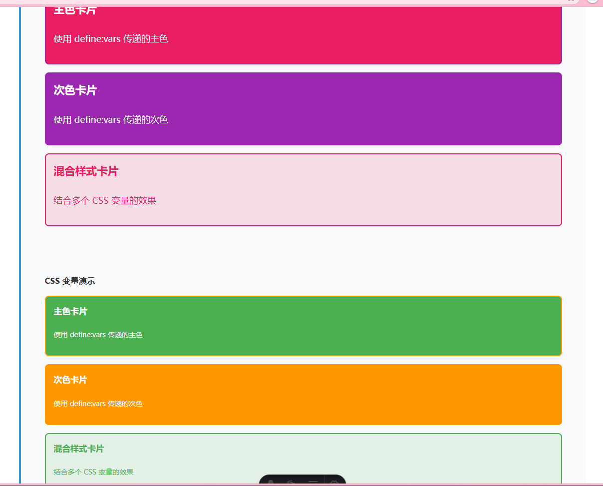
内联样式
InlineStyles.astro
---
// 内联样式演示组件
const { bgColor = "#f0f8ff", textColor = "#333", padding = "1rem" } = Astro.props;

// 动态样式对象
const dynamicStyles = {
  backgroundColor: bgColor,
  color: textColor,
  padding: padding,
  borderRadius: "8px",
  border: `2px solid ${textColor}`,
  margin: "1rem 0"
};
---

<div class="inline-demo">
  <h3>内联样式演示</h3>

  <!-- 字符串形式的内联样式 -->
  <div style="background: linear-gradient(45deg, #ff6b6b, #4ecdc4); color: white; padding: 1rem; border-radius: 8px; margin: 1rem 0;">
    <h4>字符串内联样式</h4>
    <p>直接写 CSS 字符串</p>
  </div>

  <!-- 对象形式的内联样式 -->
  <div style={{
    background: "#ffe066",
    color: "#333",
    padding: "1rem",
    borderRadius: "8px",
    border: "2px dashed #ffcc02",
    margin: "1rem 0",
    textAlign: "center"
  }}>
    <h4>对象内联样式</h4>
    <p>使用 JavaScript 对象定义样式</p>
  </div>

  <!-- 动态内联样式 -->
  <div style={dynamicStyles}>
    <h4>动态内联样式</h4>
    <p>通过 props 传递的动态样式</p>
    <p>背景色: {bgColor}</p>
    <p>文字色: {textColor}</p>
  </div>

  <!-- 混合样式 -->
  <div
    class="mixed-style"
    style={{
      transform: `rotate(${Math.random() * 10 - 5}deg)`,
      boxShadow: "0 4px 8px rgba(0,0,0,0.1)"
    }}
  >
    <h4>混合样式</h4>
    <p>CSS 类 + 内联样式</p>
  </div>
</div>

<style>
  .inline-demo {
    padding: 1rem;
    border: 1px solid #ddd;
    border-radius: 8px;
  }

  .mixed-style {
    background: #e8f5e9;
    color: #2e7d32;
    padding: 1rem;
    border-radius: 8px;
    margin: 1rem 0;
    transition: transform 0.3s ease;
  }

  .mixed-style:hover {
    transform: rotate(0deg) !important;
  }

  h4 {
    margin-top: 0;
  }
</style> 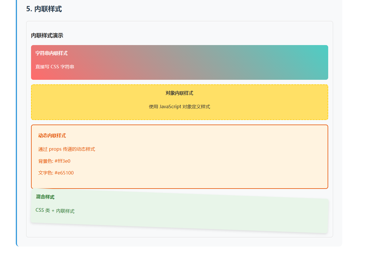
外部样式表
ExternalStyles.astro
---
// 外部样式表演示组件
import '../styles/external.css';
---

<div class="external-demo">
  <h3>外部样式表演示</h3>

  <div class="external-card">
    <h4>外部样式卡片</h4>
    <p class="utility-text">
      这个卡片使用了从 <span class="highlight">external.css</span> 导入的样式
    </p>
    <button class="external-button">外部样式按钮</button>
  </div>

  <div class="info-box">
    <h4>导入方式</h4>
    <pre><code>import '../styles/external.css';</code></pre>
    <p>在组件顶部导入外部 CSS 文件</p>
  </div>
</div>

<style>
  .external-demo {
    padding: 1rem;
    border: 1px solid #ddd;
    border-radius: 8px;
  }

  .info-box {
    background: #f8f9fa;
    padding: 1rem;
    border-radius: 6px;
    border-left: 4px solid #007acc;
  }

  .info-box h4 {
    margin-top: 0;
    color: #007acc;
  }

  pre {
    background: #e9ecef;
    padding: 0.5rem;
    border-radius: 4px;
    overflow-x: auto;
  }

  code {
    font-family: 'Courier New', monospace;
    color: #d63384;
  }
</style>
external.css
/* 外部样式表 - external.css */

.external-card {
  background: linear-gradient(135deg, #667eea 0%, #764ba2 100%);
  color: white;
  padding: 2rem;
  border-radius: 12px;
  margin: 1rem 0;
  box-shadow: 0 8px 16px rgba(0,0,0,0.1);
}

.external-card h4 {
  margin-top: 0;
  font-size: 1.5rem;
}

.external-button {
  background: rgba(255,255,255,0.2);
  color: white;
  border: 2px solid rgba(255,255,255,0.3);
  padding: 0.5rem 1rem;
  border-radius: 6px;
  cursor: pointer;
  transition: all 0.3s ease;
}

.external-button:hover {
  background: rgba(255,255,255,0.3);
  transform: translateY(-2px);
}

.utility-text {
  font-size: 1.1rem;
  line-height: 1.6;
}

.highlight {
  background: rgba(255,255,255,0.2);
  padding: 0.2rem 0.5rem;
  border-radius: 4px;
} 
Sass 预处理器
SassDemo.astro
---
// Sass 预处理器演示组件
const { theme = 'light' } = Astro.props;
---

<div class="sass-demo" data-theme={theme}>
  <h3>Sass 预处理器演示</h3>

  <div class="card">
    <h4>Sass 功能展示</h4>
    <p>这个组件使用了 Sass 的高级功能</p>

    <div class="features">
      <div class="feature">变量</div>
      <div class="feature">嵌套</div>
      <div class="feature">混合器</div>
      <div class="feature">函数</div>
    </div>

    <button class="btn btn--primary">主要按钮</button>
    <button class="btn btn--secondary">次要按钮</button>
  </div>
</div>

<style lang="scss">
  // Sass 变量
  $primary-color: #3498db;
  $secondary-color: #e74c3c;
  $border-radius: 8px;
  $spacing: 1rem;

  // Sass 混合器
  @mixin button-style($bg-color, $text-color: white) {
    background: $bg-color;
    color: $text-color;
    border: none;
    padding: $spacing * 0.5 $spacing;
    border-radius: $border-radius * 0.5;
    cursor: pointer;
    transition: all 0.3s ease;
    margin-right: $spacing * 0.5;

    &:hover {
      background: darken($bg-color, 10%);
      transform: translateY(-2px);
    }
  }

  // Sass 函数
  @function calculate-shadow($depth) {
    @return 0 #{$depth * 2}px #{$depth * 4}px rgba(0,0,0,0.1);
  }

  .sass-demo {
    padding: $spacing;
    border: 1px solid #ddd;
    border-radius: $border-radius;

    // 嵌套选择器
    .card {
      background: white;
      padding: $spacing * 1.5;
      border-radius: $border-radius;
      box-shadow: calculate-shadow(2);
      margin: $spacing 0;

      h4 {
        margin-top: 0;
        color: $primary-color;

        // 深层嵌套
        &::after {
          content: " ✨";
        }
      }

      .features {
        display: grid;
        grid-template-columns: repeat(auto-fit, minmax(100px, 1fr));
        gap: $spacing * 0.5;
        margin: $spacing 0;

        .feature {
          background: lighten($primary-color, 40%);
          color: $primary-color;
          padding: $spacing * 0.5;
          border-radius: $border-radius * 0.5;
          text-align: center;
          font-weight: bold;

          &:hover {
            background: lighten($primary-color, 30%);
          }
        }
      }
    }

    // 使用混合器
    .btn {
      &--primary {
        @include button-style($primary-color);
      }

      &--secondary {
        @include button-style($secondary-color);
      }
    }

    // 主题切换
    &[data-theme="dark"] {
      background: #2c3e50;
      color: white;

      .card {
        background: #34495e;
        color: white;
      }
    }
  }
</style> 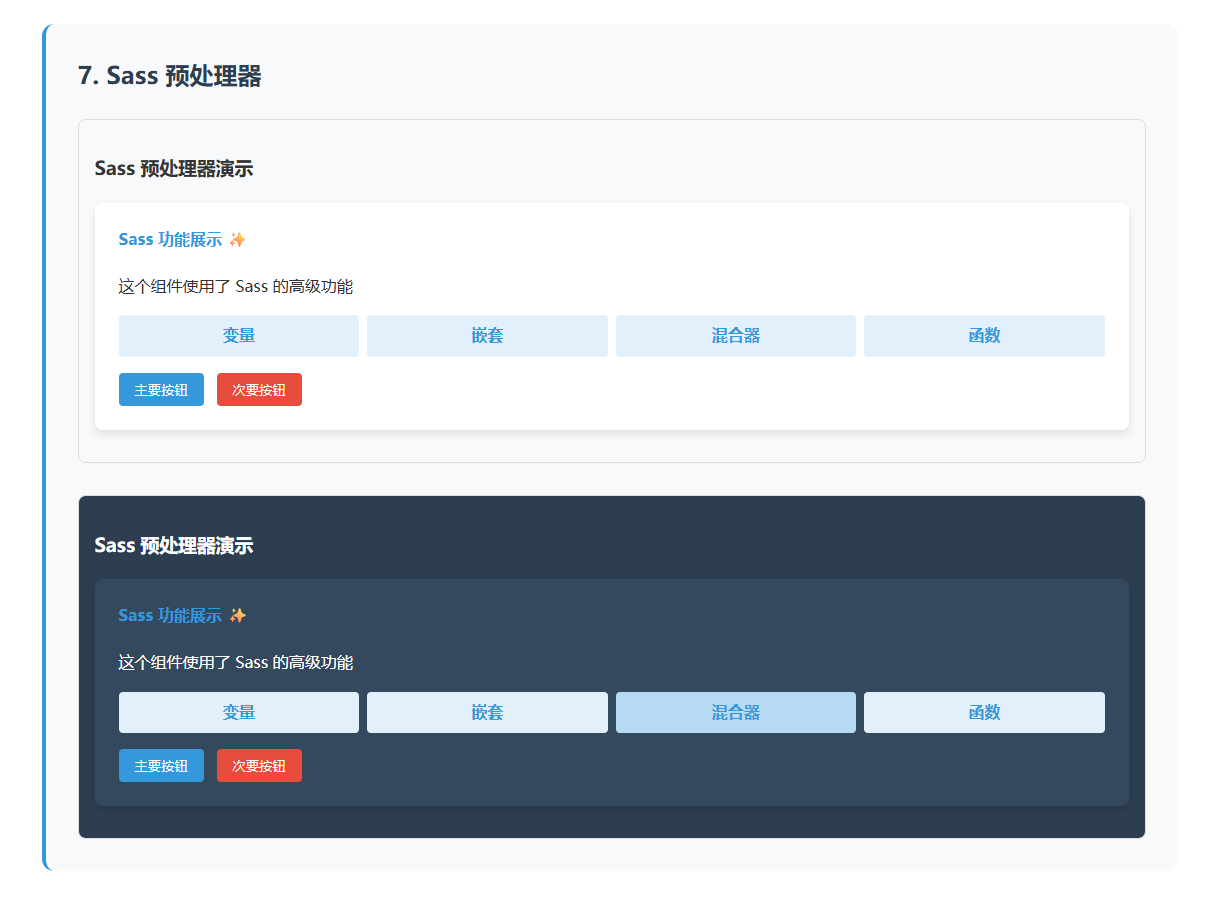
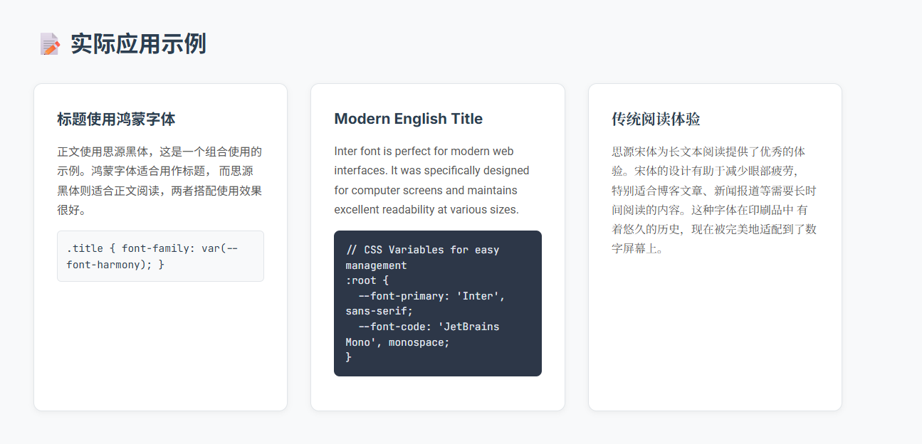
字体
看官方文档就行,很详细
语法高亮
Astro 内置了对 Shiki 和 Prism 的支持。这为以下内容提供了语法高亮:
所有在 Markdown 或 MDX 文件中使用的 代码围栏 (```)。
.astro文件中使用<Prism />组件(由 Prism 提供支持)的内容。
添加 社区集成,如 Expressive Code ,以便在代码块中获取更多的文本标记和注解选项。
那这意味shiki更好么?
看需求,我个人使用场景下,prism更适合我,引用为一个js组件,检测code自动赋值这种方式更适合我
🎯 核心问题
Astro Shiki 的根本局限性:
⚡ 构建时处理 - 只能处理构建时已知的代码
📝 静态内容导向 - 适合预定义的 Markdown/代码
❌ 无法处理动态内容 - CMS、用户输入、实时内容等
📊 使用场景对比
客户端方案(Prism、Highlight.js、CodeMirror、Monaco Editor)